How to Choose a Kitchen Cabinet Color You Will Not Regret
Choosing a cabinet color you will still like years from now starts with the parts of your kitchen that are not changing. Look at the counters, backsplash, flooring, appliances, and natural light before comparing paint swatches. A cabinet color can look beautiful on its own and still feel wrong once it covers most of the kitchen.
At Cascade Painting & Restoration, we encourage homeowners to evaluate color in the actual room rather than choosing from a small sample under store lighting. Our interior painting services include cabinets, walls, ceilings, trim, and doors throughout the Portland metro area. Looking at the whole room lets us see how the finishes will interact before painting begins.
Start With the Materials That Will Remain
Cabinets take up a large amount of visual space, but they still need to work with the permanent materials around them.
Begin with any feature that will remain after the cabinets are painted:
- Countertops
- Backsplash tile
- Flooring
- Appliances
- Wood trim
- Adjacent rooms
- Large kitchen fixtures
A countertop with warm cream, brown, or gold veining usually relates differently to paint than a cool white surface with blue-gray veining. The same principle applies to floors. Honey-toned wood can make a cool gray cabinet look bluer, while cool tile can make a warm beige look more yellow.
You do not need every surface to match. In fact, a room often looks flatter when every color is nearly identical. The colors should share a compatible temperature or create an intentional contrast.
If you plan to replace the counters or backsplash soon, make those decisions before settling on the cabinet color. Cabinets are harder and more disruptive to repaint than walls, so they should coordinate with the kitchen’s longer-term plan.
Learn to Recognize the Undertone
Undertones cause many of the cabinet color regrets we hear about. A color may appear white, gray, beige, or green at first glance, but its underlying cast becomes more noticeable next to other materials.
Common undertones include:
- Blue
- Green
- Violet
- Yellow
- Pink
- Peach
White cabinets illustrate the problem clearly. Some whites look crisp and slightly cool. Others contain cream or yellow. A cool white beside a warm stone countertop may make the stone look dingy. A creamy white next to a bright white appliance can appear more yellow than expected.
Gray creates similar issues. Many grays lean blue, green, or violet once they cover a large surface. A small gray sample that looked neutral at the store may read as pale blue in a north-facing Portland kitchen.
Compare possible cabinet colors directly against your counters, flooring, and backsplash. If two finishes clash, you will usually notice the problem more quickly when they touch than when you view them from opposite sides of the room.
Decide How Much Contrast You Want
The amount of contrast affects how the entire kitchen feels.
Light cabinets paired with light walls create a softer, more continuous appearance. Dark cabinets against light walls give the room more definition and place greater emphasis on the cabinetry. A medium-tone color often works well when you want visible color without making the cabinets the darkest feature in the room.
Consider the size and layout of the kitchen, but do not assume every small kitchen needs white cabinets. A darker color can look polished in a compact room when the space has enough light and some visual relief from counters, walls, or open areas.
Large kitchens can also feel unbalanced if every cabinet receives the same heavy color. In that situation, homeowners sometimes use one color on the perimeter cabinets and another on an island. This approach works best when the difference looks intentional and both colors connect to the room’s fixed materials.
Two-tone cabinets introduce more decisions, so use them for a clear reason. An island in a deeper shade can anchor an open kitchen. Different upper and lower cabinet colors can reduce the visual weight of a wall of cabinetry. Randomly dividing the colors tends to make the layout look busier.

Think Beyond What Is Trending
Trends provide useful inspiration, but they should not make the final decision for you. Cabinet painting is a substantial project, and popular colors can shift faster than most homeowners want to repaint their kitchens.
Ask yourself whether you like the color or simply see it everywhere. Then consider how it works with the style and age of your home.
Muted green may feel natural in one kitchen because it connects with warm wood, stone, and garden views. The same green may look disconnected in a room dominated by cool tile and stainless steel. Deep navy can feel classic with the right surroundings, but it may darken a kitchen that receives limited daylight.
Neutrals also change with trends. Yesterday’s cool gray may give way to warmer taupe, cream, or mushroom shades, but no neutral remains completely trend-free. Choose the version that suits your home instead of chasing the newest variation.
If you tend to change decor frequently, a versatile cabinet color gives you more freedom. You can introduce stronger colors through walls, hardware, stools, window treatments, and accessories, all of which are easier to update.
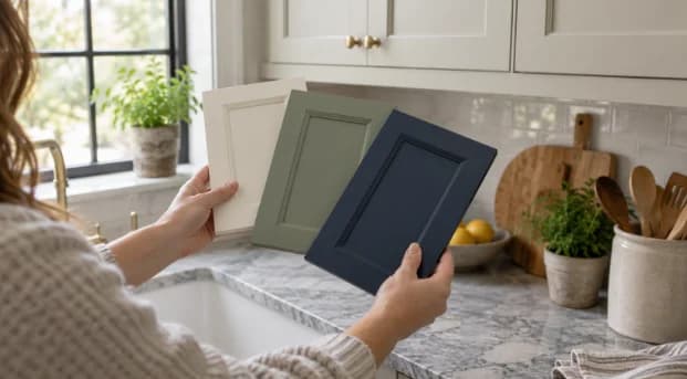
Test Cabinet Colors in the Kitchen
Never approve a cabinet color from a digital image alone. Phone screens, computer monitors, editing, and surrounding decor all affect how the color appears.
Start with several physical chips, then narrow the options to a few larger samples. Benjamin Moore’s paint-sampling guidance recommends checking colors from morning through evening under natural and artificial light.
Place samples vertically at cabinet height instead of laying them flat on a counter. Light reaches horizontal and vertical surfaces differently. Move the samples to several areas, including:
- Next to the countertop and backsplash
- Near the refrigerator or range
- Beside the flooring
- On upper and lower cabinet sections
- In the darkest corner of the room
- Near a window
- Under existing kitchen lights
Check the samples on bright days and overcast days if possible. Portland’s gray seasonal light can pull cool tones forward and make some colors look flatter than they do in direct sun.
Look again after sunset with the kitchen lights on. Bulb temperature matters. Warm bulbs can make cream, beige, and warm white look more yellow. Cooler lighting may emphasize blue or green undertones.
Give yourself a few days before deciding. The color that grabs your attention first is not always the one that feels best after repeated viewing.
Account for Sheen and Cabinet Finish
Color samples show the general hue, but the finished coating may reflect light differently. Cabinets need a coating suited to frequent handling, splashes, grease, and cleaning. That finished surface can make a color appear slightly richer or more reflective than a flat sample card.
Darker colors tend to show dust, fingerprints, and surface irregularities more easily, especially under strong side lighting. Very bright whites may reveal gaps, shadows, and variations between doors more clearly.
The existing cabinet surface matters too. Wood grain may remain visible after painting unless the project includes additional filling and preparation. Previous coatings, damaged areas, grease buildup, and loose hardware also need attention before the finish coats go on.
Color does not conceal poor preparation. Cleaning, sanding, priming, and addressing damaged surfaces all influence how even the final color looks.
Coordinate the Cabinets and Walls
Cabinet and wall colors should be selected together, even if you plan to paint them at different times.
Using the exact same color on both surfaces can create a continuous look, but the results may not appear identical. Cabinet coatings and wall paint often use different formulas and sheens. Light will reflect from them differently.
If you want contrast, compare the two colors at their actual meeting points. A slightly off-white cabinet beside a different off-white wall can look accidental if their undertones conflict. A clearer difference usually looks more deliberate.
Project order matters as well. In most combined kitchen projects, completing the more involved cabinet preparation before the final wall coats keeps the workflow cleaner. Our guide to painting kitchen cabinets before or after the walls explains how the sequence affects masking, dust, touch-ups, and final cut lines.
Consider Daily Use
A color needs to work with the way the household uses the kitchen.
Homes with children, pets, or frequent cooking may need a shade that does not show every fingerprint or splash. Mid-tone colors often disguise everyday marks better than very dark or very bright finishes. Hardware also reduces direct contact with painted doors and drawer fronts.
Think about how often you want to clean the cabinets and what tends to collect near handles, the range, the sink, and trash storage. Color will not change the cabinet coating’s actual durability, but it affects how quickly dirt becomes visible.
Also consider whether you plan to sell soon. You do not have to choose a bland color, but a highly specific shade may appeal to a narrower group of buyers. A restrained cabinet color that fits the home usually gives future owners more flexibility.
Make the Final Decision From the Whole Room
The safest cabinet color is not automatically white, beige, or gray. It is the color that relates well to the kitchen’s permanent surfaces, looks right under the room’s actual lighting, and still suits how you want the space to feel after the current trends change.
Before committing, confirm the undertone, compare it directly with nearby materials, view a large sample for several days, and decide whether the level of contrast works throughout the room. Review the color under both daylight and artificial light.
Cascade Painting & Restoration paints cabinets and surrounding interior surfaces for homeowners across the Portland metro area. If you are deciding between cabinet colors or need an estimate for the complete project, contact our team to schedule a walkthrough. We can review the existing surfaces, preparation needs, and project scope before the painting starts.
Recent Blogs
september 25, 2026
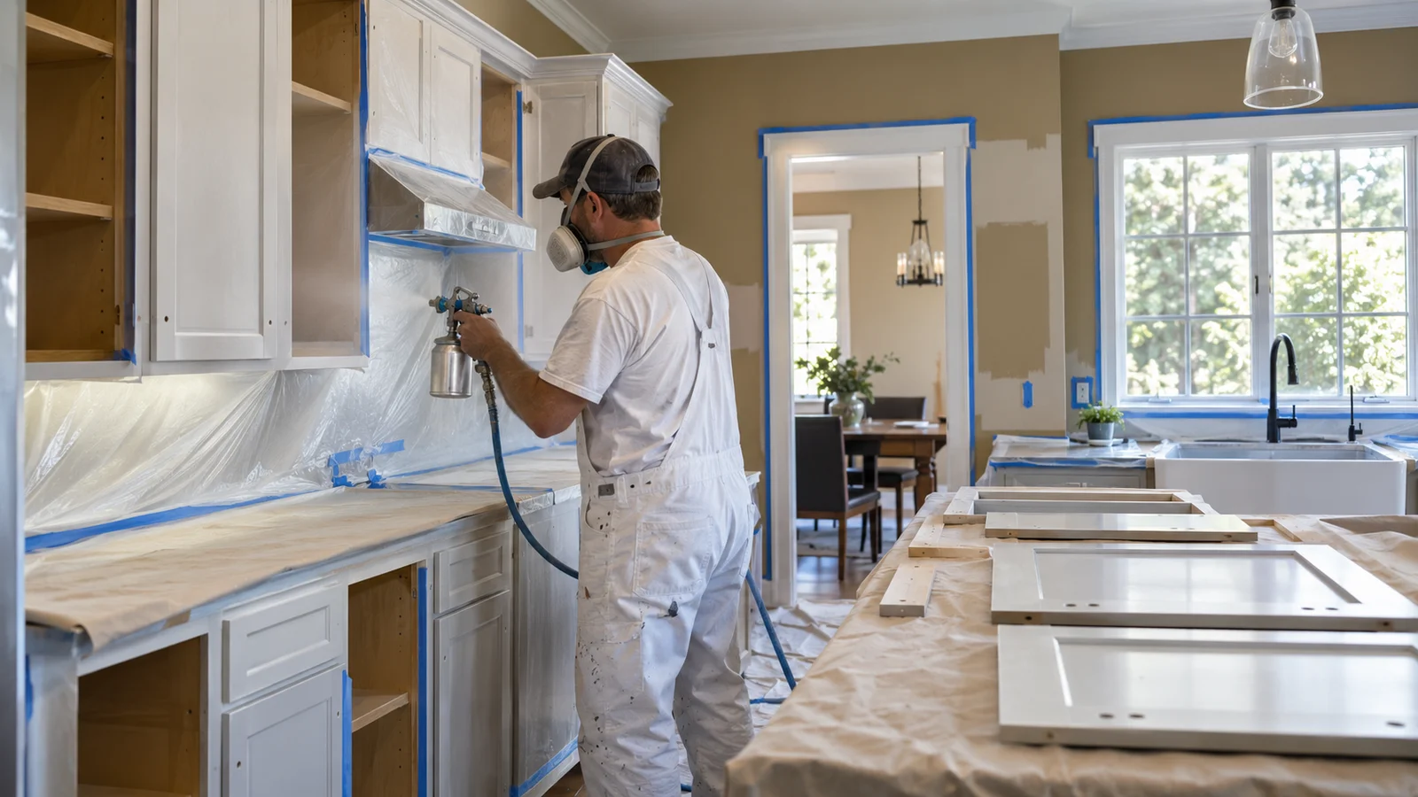
Should You Paint Kitchen Cabinets Before or After Repainting the Walls?
september 21, 2026
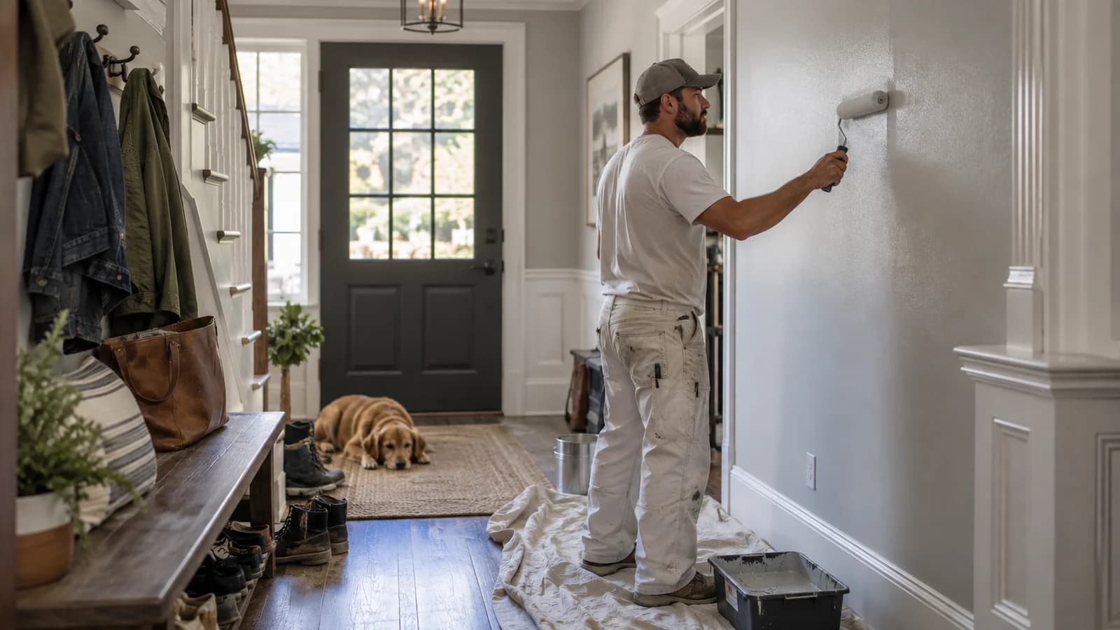
Flat, Eggshell, or Satin: Which Paint Finish Is Best for High-Traffic Rooms?
september 20, 2026
Can You Smooth Textured Walls Without Replacing the Drywall?
september 15, 2026
How Often Should You Repaint Interior Walls in a Portland Home?
august 3, 2026
Painting an Older Portland Home: What Should Be Checked First?
Contact Information
Reach out to us for a free estimate. We're here to help with all your painting needs.
- Call At:(503) 936-3255
- Email Us At:cascadepaintandres@gmail.com
- Hours:Mon–Sun 8 AM – 6 PM
- Serving:Portland Metro Area